BEYOND THE LABEL
OUR LIGHTBULB MOMENT
Go beyond the label, and experience the new Orin Swift space in Downtown St. Helena, in Napa Valley.
OCTOBER 10 2023
BEYOND THE LABEL
OCTOBER 10 2023
“The blaze of crimson light from the tube told its own story and was a sight to dwell upon and never forget.”
That’s how Morris Travers felt when he first discovered the red glow of neon emanating from the Geissler tubes in his lab in 1898. Dave didn’t use the exact same words to describe the feeling of seeing the new OSC sign lit up on the facade of the new space in Downtown St. Helena, but the sense of awe was shared.
When designing the new Napa Valley space, Dave Phinney and the team left no stone (or rock) unturned. Each design decision focused on how to respect the building’s history and how to express the brand’s future. We wanted the sign to be more than a functional tool to find us, we wanted it to serve as a beacon for what we stand for.
At our original tasting room, the ORIN SWIFT that spans the facade was lovingly painted by hand. Not only did we love the look, it was a way for us to work with and support the increasingly rare talent of hand lettering. (Though not nearly as precise, Dave has even done a little hand lettering himself recently for Equinox XIV.) When it came time to create the signage for 1321 Main Street, we looked at many options, but the one that we couldn’t resist was neon.
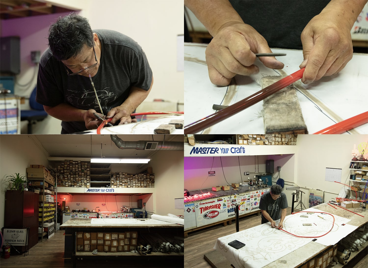
This choice opened the door to, yet again, working with a master of an increasingly rare craft. Our search led us to Kevin Chong. Based in San Jose, and trained in Portland, Kevin has hand-shaped thousands of signs and is one of the few remaining neon artists in California.

The process begins with taking a drawing – in this case, our logo – and scaling it up to complement the architecture of the building. From there, a true merging of art and science takes place. The color is determined by a fluorescent coating that lines the interior of the glass tube. As the neon gas is charged and emits a glow, the coating absorbs different wavelengths of light, resulting in a single, pure color. When neon lights were first introduced in the early 1900s, there were only a handful of colors possible, but research breakthroughs opened up the full spectrum by the 1960s. We worked with Kevin and the team at Silica Valley Glass Studio to select a red that matched our brand color. Next came the art of the bend. Though Kevin makes it look easy, this process is anything but. It requires rethinking the flat graphic as a three-dimensional form and hand-shaping each piece with precision. If you know Dave, you can imagine how happy he was to see the analog process — not a computer in sight.
With the glass coated, shaped, and filled with a specific concentration of neon gas, it was time to test it out. With a flip of a switch, a buzz of red filled the room. With great care, the sign was packaged and sent north to St. Helena for installation.
Surely, at some point, the daily act of turning the sign on will become routine, but today, as we turn it on for the first time, we’re feeling a lot like Morris Travers did over a century ago as our beacon, a blaze of crimson, fills the night sky.
PS. A lot of Dave’s creative work happens in an office across the street, adorned with a 4 letter neon sign — see if you can spot it next time you visit the tasting room.
We welcome you to stop by and visit us at our new
space located in downtown St. Helena.
For exclusive updates and news,
follow us on Instagram.


